
Hanging Punctuation
One of the most powerful uses of CSS is to control the typography in your document. From font choices to leading, word and letter spacing, using a style sheet gives you much more control over how your page is rendered in a browser, without resorting to ugly hacks that destroy the structure of your page, and often its accessibility as well.
When Adobe first came out with InDesign, one of its highly touted features was the ability to handle hanging punctuation. When you have punctuation that appears at the beginning of a line in a paragraph that is left justified, it makes the text look uneven.
Hanging punctuation puts the punctuation into the left margin so the text lines up.
Using CSS we can emulate this behavior for the BLOCKQUOTE tag. The basic idea is to create a negative indent, or outdent, for the first line of the BLOCKQUOTE. How much to outdent depends on the font, but somewhere in the neighborhood of -0.5em usually works. Using em units keeps the amount relative to the size of the font, allowing for resizing of the text while maintaining a proper outdent.
Here’s the very basic CSS:
blockquote, blockquote p {
	text-indent: -0.5em;
	}
The blockquote p above is necessary if you are marking up documents to conform to XHTML strict (as this document is). The strict DTD requires that BLOCKQUOTEs only contain block level elements, like P, so I added the second selector to the rule for pages that will use XHTML 1/1.1 strict.
The main thing you need to remember in your markup is to always use quotes at the beginning of your BLOCKQUOTE text:
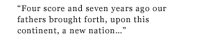
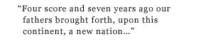
“Four score and seven years ago our fathers brought forth, upon this continent, a new nation, conceived in liberty, and dedicated to the proposition that ‘all men are created equal’....”
applications and caveats
You can use this technique for any kind of glyph that might disrupt the visual flow along the left side of a block of text. I do this with the permalinks on my blog that I've set off between a pair of double angle quotation marks »plink« (an accessibility nightmare, I'm sure, since they are also pointing in the wrong direction). And you can see a similar application in the navigation at the top of this page.
While this technique is NN4 friendly, it falls apart in Opera. Instead of properly outdenting the first line, Opera applies the negative indent as if it were a positive indent, thus creating an even worse problem than if it had ignored the text-indent all together. Hopefully it will be fixed soon. HOwever, if you code to XHTML strict, the contents of the BLOCKQUOTE must be block level elements, and marking up the quoted text with P tags (and including the above rule in your CSS) will help Opera not to break so badly.